- 浪漫主题:使用粉色和紫色的渐变背景,营造温馨浪漫的氛围。
- 动画效果:包含了心跳动画、星星闪烁、文字淡入等效果,让页面更生动。
- 互动性:当鼠标移动时,会有小星星跟随,增加趣味性。
- 会分步骤、分动画地展现,引导对方一步步进入情绪。
- 核心互动:设计了两个按钮,一个“再等等”和一个“我愿意”,点击“再等等”按钮会触发一系列可爱的“撒娇”和“挽留”效果,最终指向“我愿意”。
如何使用?
- 复制代码:将下面所有的代码完整地复制下来。
- 创建文件:在你的电脑上新建一个文本文档(.txt文件)。
- 粘贴并保存:将复制的代码粘贴到这个文本文档中,然后将文件名从
新建文本文档.txt修改为love.html。注意:后缀名必须是.html。 - 打开网页:找到这个
love.html文件,用任何浏览器(如 Chrome, Edge, Firefox)打开它即可。
表白网页代码 (love.html)
<!DOCTYPE html>
<html lang="zh-CN">
<head>
    <meta charset="UTF-8">
    <meta name="viewport" content="width=device-width, initial-scale=1.0">一份给你的心意</title>
    <style>
        /* 全局样式 */
        * {
            margin: 0;
            padding: 0;
            box-sizing: border-box;
        }
        body {
            font-family: 'Microsoft YaHei', '微软雅黑', sans-serif;
            background: linear-gradient(135deg, #ff9a9e 0%, #fecfef 50%, #fecfef 100%);
            height: 100vh;
            overflow: hidden;
            display: flex;
            justify-content: center;
            align-items: center;
            position: relative;
            cursor: url('data:image/svg+xml;utf8,<svg xmlns="http://www.w3.org/2000/svg" width="32" height="32" viewBox="0 0 32 32"><text y="28" font-size="28">💖</text></svg>'), auto;
        }
        /* 主容器 */
        .container {
            text-align: center;
            z-index: 10;
            padding: 2rem;
            background: rgba(255, 255, 255, 0.2);
            border-radius: 20px;
            backdrop-filter: blur(10px);
            box-shadow: 0 8px 32px rgba(31, 38, 135, 0.2);
            max-width: 90%;
            animation: fadeIn 2s ease-in-out;
        }
        /* 标题样式 */
        h1 {
            color: #fff;
            font-size: 3rem;
            margin-bottom: 1.5rem;
            text-shadow: 2px 2px 4px rgba(0, 0, 0, 0.2);
            animation: fadeInDown 1s ease-out 0.5s both;
        }
        /* 心跳动画 */
        .heart {
            color: #ff4d94;
            font-size: 5rem;
            display: inline-block;
            animation: heartbeat 1.5s ease-in-out infinite;
            margin-bottom: 2rem;
        }
        /* 文字样式 */
        p {
            color: #fff;
            font-size: 1.5rem;
            line-height: 1.8;
            margin-bottom: 2rem;
            text-shadow: 1px 1px 3px rgba(0, 0, 0, 0.2);
            animation: fadeIn 2s ease-in-out 1s both;
        }
        /* 按钮容器 */
        .buttons {
            display: flex;
            justify-content: center;
            gap: 2rem;
            animation: fadeIn 2s ease-in-out 1.5s both;
        }
        /* 按钮基础样式 */
        button {
            padding: 15px 40px;
            font-size: 1.2rem;
            border: none;
            border-radius: 50px;
            cursor: pointer;
            transition: all 0.3s ease;
            font-weight: bold;
            box-shadow: 0 4px 15px rgba(0, 0, 0, 0.2);
        }
        /* 拒绝按钮样式 */
        #no-btn {
            background-color: #ff6b6b;
            color: white;
        }
        #no-btn:hover {
            background-color: #ff5252;
            transform: scale(1.05);
        }
        /* 接受按钮样式 */
        #yes-btn {
            background-color: #4ecdc4;
            color: white;
        }
        #yes-btn:hover {
            background-color: #26a69a;
            transform: scale(1.05);
        }
        /* 星星背景 */
        .stars {
            position: fixed;
            top: 0;
            left: 0;
            width: 100%;
            height: 100%;
            pointer-events: none;
            z-index: 1;
        }
        .star {
            position: absolute;
            background-color: white;
            clip-path: polygon(50% 0%, 61% 35%, 98% 35%, 68% 57%, 79% 91%, 50% 70%, 21% 91%, 32% 57%, 2% 35%, 39% 35%);
            animation: twinkle 3s infinite;
        }
        /* 跟随鼠标的小星星 */
        .cursor-star {
            position: fixed;
            pointer-events: none;
            z-index: 9999;
            opacity: 0;
            animation: fadeOut 1s ease-out forwards;
        }
        /* 动画定义 */
        @keyframes heartbeat {
            0% { transform: scale(1); }
            25% { transform: scale(1.1); }
            50% { transform: scale(1); }
            75% { transform: scale(1.1); }
            100% { transform: scale(1); }
        }
        @keyframes fadeIn {
            from { opacity: 0; }
            to { opacity: 1; }
        }
        @keyframes fadeInDown {
            from {
                opacity: 0;
                transform: translateY(-30px);
            }
            to {
                opacity: 1;
                transform: translateY(0);
            }
        }
        @keyframes twinkle {
            0%, 100% { opacity: 0.2; transform: scale(1); }
            50% { opacity: 1; transform: scale(1.2); }
        }
        @keyframes fadeOut {
            0% { opacity: 1; transform: scale(1); }
            100% { opacity: 0; transform: scale(0); }
        }
        @keyframes shake {
            0%, 100% { transform: translateX(0); }
            10%, 30%, 50%, 70%, 90% { transform: translateX(-10px); }
            20%, 40%, 60%, 80% { transform: translateX(10px); }
        }
        .shake {
            animation: shake 0.5s ease-in-out;
        }
        /* 响应式设计 */
        @media (max-width: 768px) {
            h1 { font-size: 2rem; }
            p { font-size: 1.2rem; }
            .buttons { flex-direction: column; gap: 1rem; }
            button { width: 80%; }
        }
    </style>
</head>
<body>
    <!-- 星星背景 -->
    <div class="stars" id="stars"></div>
    <!-- 主要内容 -->
    <div class="container">
        <h1>给你的表白</h1>
        <div class="heart">💖</div>
        <p id="message">遇见你的每一天,都像星星一样闪亮,你愿意成为我生命中最亮的那一颗星吗?</p>
        <div class="buttons">
            <button id="no-btn">再等等</button>
            <button id="yes-btn">我愿意</button>
        </div>
    </div>
    <script>
        // 生成背景星星
        const starsContainer = document.getElementById('stars');
        for (let i = 0; i < 100; i++) {
            const star = document.createElement('div');
            star.classList.add('star');
            star.style.width = Math.random() * 3 + 'px';
            star.style.height = star.style.width;
            star.style.left = Math.random() * 100 + '%';
            star.style.top = Math.random() * 100 + '%';
            star.style.animationDelay = Math.random() * 3 + 's';
            starsContainer.appendChild(star);
        }
        // 获取DOM元素
        const noBtn = document.getElementById('no-btn');
        const yesBtn = document.getElementById('yes-btn');
        const message = document.getElementById('message');
        const container = document.querySelector('.container');
        // 拒绝按钮的点击事件
        noBtn.addEventListener('click', () => {
            // 添加抖动效果
            container.classList.add('shake');
            setTimeout(() => container.classList.remove('shake'), 500);
            // 改变按钮文字
            const messages = [
                "再考虑一下嘛~",
                "不要拒绝我好不好😢",
                "你忍心让我难过吗?",
                "我真的好喜欢你...",
                "给我一个机会,好吗?"
            ];
            const randomMessage = messages[Math.floor(Math.random() * messages.length)];
            noBtn.textContent = randomMessage;
            // 让“我愿意”按钮稍微变大一点
            const currentYesSize = parseFloat(window.getComputedStyle(yesBtn).fontSize);
            yesBtn.style.fontSize = (currentYesSize + 2) + 'px';
        });
        // 接受按钮的点击事件
        yesBtn.addEventListener('click', () => {
            message.textContent = "太棒了!💕 我会一辈子对你好的!";
            noBtn.style.display = 'none';
            yesBtn.textContent = '爱你哟!😘';
            // 增加更多动画效果
            container.style.animation = 'none';
            setTimeout(() => {
                container.style.animation = 'fadeIn 1s ease-in-out';
            }, 10);
            // 创建庆祝效果
            for (let i = 0; i < 50; i++) {
                setTimeout(() => {
                    const celebrationStar = document.createElement('div');
                    celebrationStar.classList.add('star', 'cursor-star');
                    celebrationStar.style.width = '10px';
                    celebrationStar.style.height = '10px';
                    celebrationStar.style.left = Math.random() * window.innerWidth + 'px';
                    celebrationStar.style.top = Math.random() * window.innerHeight + 'px';
                    document.body.appendChild(celebrationStar);
                    setTimeout(() => celebrationStar.remove(), 1000);
                }, i * 50);
            }
        });
        // 鼠标移动时创建小星星
        document.addEventListener('mousemove', (e) => {
            if (Math.random() > 0.98) { // 降低生成频率
                const star = document.createElement('div');
                star.classList.add('cursor-star');
                star.innerHTML = '✨';
                star.style.left = e.clientX + 'px';
                star.style.top = e.clientY + 'px';
                star.style.fontSize = '20px';
                document.body.appendChild(star);
                setTimeout(() => star.remove(), 1000);
            }
        });
    </script>
</body>
</html>
如何个性化?
你可以轻松地修改代码中的部分内容,让它更贴合你的心意:
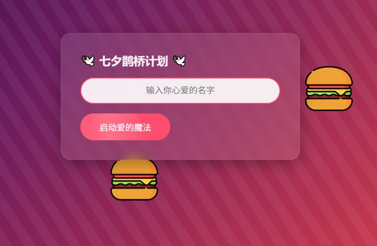
(图片来源网络,侵删)
-
修改表白文字:
- 找到
<h1>给你的表白</h1>,把给你的表白改成你喜欢的称呼或标题。 - 找到
<p id="message">...</p>,把里面的文字改成你想说的话。
- 找到
-
修改“再等等”按钮的文字:
- 在
<script>标签里,找到messages数组,在里面添加或修改你想要的“撒娇”话语。
- 在
-
修改最终接受后的文字:
- 找到
yesBtn.addEventListener('click', ...)函数里的message.textContent = "太棒了!💕 我会一辈子对你好的!";这一行,把它改成你承诺的话。
- 找到
-
修改颜色和主题:
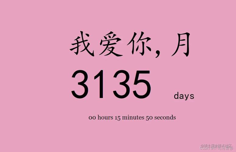 (图片来源网络,侵删)
- 在
<style>标签的开头,找到background: linear-gradient(...)这一行,可以修改颜色代码来改变背景渐变色,你可以在网上搜索 "CSS gradient generator" 来找到喜欢的颜色组合。
- 在
希望这份代码能帮你成功向她/他表白!祝你好运!🎉
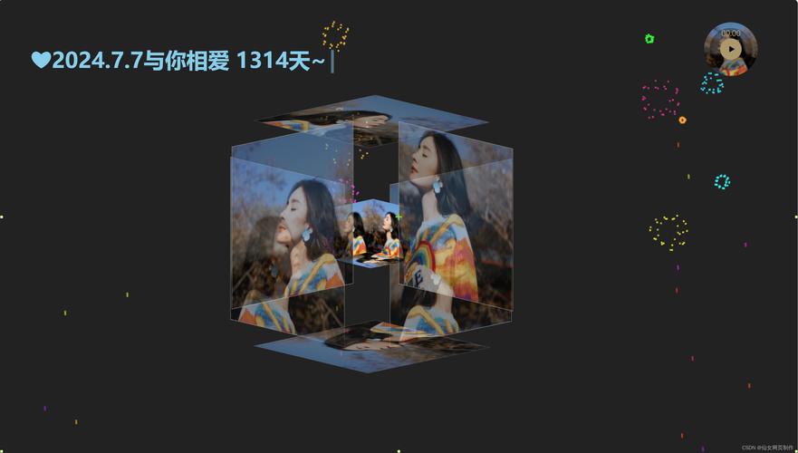
(图片来源网络,侵删)


