极简单页版
这个模板非常简洁,重点突出个人信息,适合作为快速的个人主页或在线名片。
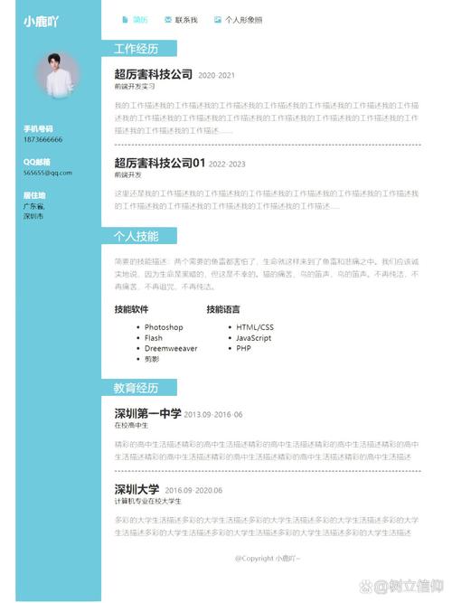
(图片来源网络,侵删)
特点:
- 响应式设计:在手机和电脑上都能良好显示。
- 纯CSS动画:悬停效果让页面更生动。
- 代码简洁:易于理解和修改。
代码:
<!DOCTYPE html>
<html lang="zh-CN">
<head>
    <meta charset="UTF-8">
    <meta name="viewport" content="width=device-width, initial-scale=1.0">我的自我介绍</title>
    <style>
        /* 全局样式 */
        * {
            margin: 0;
            padding: 0;
            box-sizing: border-box;
            font-family: 'Arial', sans-serif;
        }
        body {
            background-color: #f0f2f5;
            color: #333;
            line-height: 1.6;
            display: flex;
            justify-content: center;
            align-items: center;
            min-height: 100vh;
            padding: 20px;
        }
        /* 主容器 */
        .container {
            background-color: #ffffff;
            border-radius: 15px;
            box-shadow: 0 10px 30px rgba(0, 0, 0, 0.1);
            max-width: 800px;
            width: 100%;
            padding: 40px;
            text-align: center;
        }
        /* 头像样式 */
        .avatar {
            width: 150px;
            height: 150px;
            border-radius: 50%;
            margin: 0 auto 20px;
            border: 5px solid #007bff;
            object-fit: cover;
            transition: transform 0.3s ease;
        }
        .avatar:hover {
            transform: scale(1.05);
        }
        h1 {
            color: #007bff;
            margin-bottom: 10px;
            font-size: 2.5em;
        }
        .subtitle {
            color: #6c757d;
            font-size: 1.2em;
            margin-bottom: 30px;
        }
        /* 关于我部分 */
        .about {
            margin-bottom: 30px;
            text-align: left;
        }
        .about p {
            margin-bottom: 15px;
        }
        /* 技能部分 */
        .skills {
            margin-bottom: 30px;
        }
        .skills h2 {
            text-align: left;
            margin-bottom: 15px;
        }
        .skill-bar {
            background-color: #e9ecef;
            height: 20px;
            border-radius: 10px;
            margin-bottom: 10px;
            overflow: hidden;
        }
        .skill-progress {
            height: 100%;
            background-color: #007bff;
            border-radius: 10px;
            text-align: right;
            line-height: 20px;
            color: white;
            font-size: 0.9em;
            padding-right: 10px;
            transition: width 1.5s ease-in-out;
        }
        /* 联系方式部分 */
        .contact {
            display: flex;
            justify-content: center;
            gap: 20px;
            flex-wrap: wrap;
        }
        .contact a {
            display: inline-block;
            padding: 10px 20px;
            background-color: #007bff;
            color: #ffffff;
            text-decoration: none;
            border-radius: 5px;
            transition: background-color 0.3s ease, transform 0.3s ease;
        }
        .contact a:hover {
            background-color: #0056b3;
            transform: translateY(-3px);
        }
    </style>
</head>
<body>
    <div class="container">
        <!-- 头像 -->
        <img src="https://via.placeholder.com/150" alt="我的头像" class="avatar">
        <!-- 标题和副标题 -->
        <h1>张三</h1>
        <p class="subtitle">前端开发工程师 | 创意设计师</p>
        <!-- 关于我 -->
        <div class="about">
            <h2>关于我</h2>
            <p>你好!我是一名充满热情的前端开发工程师,拥有5年的Web开发经验,我热爱将复杂的设计转化为优雅、高效、用户友好的代码,我专注于使用现代前端技术栈(如React, Vue, TypeScript)构建响应式和交互性强的Web应用程序。</p>
            <p>在业余时间,我喜欢探索新的技术,参与开源项目,并分享我的技术博客。</p>
        </div>
        <!-- 技能 -->
        <div class="skills">
            <h2>技能</h2>
            <div>
                <p>HTML / CSS</p>
                <div class="skill-bar">
                    <div class="skill-progress" style="width: 95%;">95%</div>
                </div>
            </div>
            <div>
                <p>JavaScript / TypeScript</p>
                <div class="skill-bar">
                    <div class="skill-progress" style="width: 90%;">90%</div>
                </div>
            </div>
            <div>
                <p>React / Vue</p>
                <div class="skill-bar">
                    <div class="skill-progress" style="width: 85%;">85%</div>
                </div>
            </div>
            <div>
                <p>UI/UX 设计</p>
                <div class="skill-bar">
                    <div class="skill-progress" style="width: 75%;">75%</div>
                </div>
            </div>
        </div>
        <!-- 联系方式 -->
        <div class="contact">
            <a href="mailto:your.email@example.com">Email</a>
            <a href="https://github.com" target="_blank">GitHub</a>
            <a href="https://linkedin.com" target="_blank">LinkedIn</a>
            <a href="tel:+1234567890">电话</a>
        </div>
    </div>
</body>
</html>
现代卡片式布局
这个模板采用更现代的卡片式设计,视觉层次分明,适合展示项目经验和详细信息。
特点:
- 网格布局:使用CSS Grid实现灵活的卡片排列。
- 悬停效果:卡片悬停时有阴影和上浮效果,增强交互感。
- 深色/浅色模式切换:增加了一个简单的主题切换功能。
代码:
<!DOCTYPE html>
<html lang="zh-CN">
<head>
    <meta charset="UTF-8">
    <meta name="viewport" content="width=device-width, initial-scale=1.0">李四 - 个人主页</title>
    <style>
        :root {
            --bg-color: #ffffff;
            --text-color: #333333;
            --card-bg: #f8f9fa;
            --primary-color: #6c5ce7;
            --secondary-color: #a29bfe;
        }
        [data-theme="dark"] {
            --bg-color: #1a1a2e;
            --text-color: #f5f5f5;
            --card-bg: #16213e;
            --primary-color: #00d2d3;
            --secondary-color: #54a0ff;
        }
        * {
            margin: 0;
            padding: 0;
            box-sizing: border-box;
            font-family: 'Segoe UI', Tahoma, Geneva, Verdana, sans-serif;
        }
        body {
            background-color: var(--bg-color);
            color: var(--text-color);
            transition: background-color 0.3s, color 0.3s;
            line-height: 1.8;
        }
        .theme-toggle {
            position: fixed;
            top: 20px;
            right: 20px;
            background: var(--primary-color);
            color: white;
            border: none;
            border-radius: 50%;
            width: 50px;
            height: 50px;
            cursor: pointer;
            font-size: 1.2em;
            transition: transform 0.3s;
        }
        .theme-toggle:hover {
            transform: scale(1.1);
        }
        .main-header {
            text-align: center;
            padding: 60px 20px 40px;
        }
        .main-header h1 {
            font-size: 3em;
            margin-bottom: 10px;
            background: linear-gradient(to right, var(--primary-color), var(--secondary-color));
            -webkit-background-clip: text;
            background-clip: text;
            color: transparent;
        }
        .main-header p {
            font-size: 1.2em;
            color: var(--text-color);
            opacity: 0.8;
        }
        .content-wrapper {
            max-width: 1200px;
            margin: 0 auto;
            padding: 0 20px;
        }
        .card-grid {
            display: grid;
            grid-template-columns: repeat(auto-fit, minmax(300px, 1fr));
            gap: 30px;
            margin-bottom: 50px;
        }
        .card {
            background-color: var(--card-bg);
            border-radius: 15px;
            padding: 30px;
            box-shadow: 0 4px 15px rgba(0, 0, 0, 0.1);
            transition: transform 0.3s, box-shadow 0.3s;
        }
        .card:hover {
            transform: translateY(-10px);
            box-shadow: 0 10px 25px rgba(0, 0, 0, 0.2);
        }
        .card h2 {
            color: var(--primary-color);
            margin-bottom: 15px;
            font-size: 1.5em;
        }
        .card ul {
            list-style-type: none;
            padding-left: 0;
        }
        .card ul li {
            padding: 8px 0;
            border-bottom: 1px solid rgba(0, 0, 0, 0.1);
        }
        .card ul li:last-child {
            border-bottom: none;
        }
        .contact-links {
            display: flex;
            justify-content: center;
            gap: 20px;
            flex-wrap: wrap;
        }
        .contact-links a {
            display: inline-flex;
            align-items: center;
            gap: 8px;
            padding: 12px 25px;
            background-color: var(--primary-color);
            color: white;
            text-decoration: none;
            border-radius: 30px;
            transition: background-color 0.3s, transform 0.3s;
        }
        .contact-links a:hover {
            background-color: var(--secondary-color);
            transform: scale(1.05);
        }
    </style>
</head>
<body>
    <button class="theme-toggle" onclick="toggleTheme()">🌙</button>
    <header class="main-header">
        <h1>李四</h1>
        <p>全栈开发工程师 | 技术爱好者</p>
    </header>
    <div class="content-wrapper">
        <div class="card-grid">
            <!-- 关于我卡片 -->
            <div class="card">
                <h2>关于我</h2>
                <p>我是一名经验丰富的全栈开发者,专注于构建高性能、可扩展的Web应用,我相信技术的力量可以改变世界,并致力于用代码创造价值,我热衷于学习新技术,并对解决复杂问题充满热情。</p>
            </div>
            <!-- 技能卡片 -->
            <div class="card">
                <h2>技术栈</h2>
                <ul>
                    <li>前端: React, Vue, Angular, TypeScript</li>
                    <li>后端: Node.js, Python (Django/Flask), Java (Spring)</li>
                    <li>数据库: MySQL, PostgreSQL, MongoDB, Redis</li>
                    <li>工具: Git, Docker, AWS, CI/CD</li>
                </ul>
            </div>
            <!-- 项目经验卡片 -->
            <div class="card">
                <h2>项目经验</h2>
                <ul>
                    <li><strong>电商平台重构</strong> - 使用微服务架构提升系统性能40%</li>
                    <li><strong>数据可视化大屏</strong> - 基于D3.js和ECharts开发实时监控面板</li>
                    <li><strong>移动端社交App</strong> - 负责核心功能模块的前后端开发</li>
                </ul>
            </div>
        </div>
        <div class="contact-links">
            <a href="mailto:lisi@example.com">📧 邮箱联系</a>
            <a href="https://github.com/lisi" target="_blank">💻 GitHub</a>
            <a href="https://blog.lisi.com" target="_blank">📝 技术博客</a>
        </div>
    </div>
    <script>
        function toggleTheme() {
            const body = document.body;
            const themeButton = document.querySelector('.theme-toggle');
            if (body.getAttribute('data-theme') === 'dark') {
                body.removeAttribute('data-theme');
                themeButton.textContent = '🌙';
                localStorage.setItem('theme', 'light');
            } else {
                body.setAttribute('data-theme', 'dark');
                themeButton.textContent = '☀️';
                localStorage.setItem('theme', 'dark');
            }
        }
        // 页面加载时检查本地存储的主题设置
        window.onload = function() {
            const savedTheme = localStorage.getItem('theme');
            if (savedTheme === 'dark') {
                document.body.setAttribute('data-theme', 'dark');
                document.querySelector('.theme-toggle').textContent = '☀️';
            }
        }
    </script>
</body>
</html>
如何使用这些模板
- 复制代码:选择你喜欢的模板,将全部HTML代码复制到一个新的文本文件中。
- 保存文件:将文件保存为
index.html。 - :
- 头像:找到
<img src="https://via.placeholder.com/150" ...>这一行,将src属性中的链接替换为你自己的头像图片链接(可以是网络地址,也可以是本地文件路径)。 - 个人信息:修改
<h1>、<p class="subtitle">以及所有<p>标签中的文字,填入你自己的姓名、职位、简介、技能和联系方式等。 - 链接:修改
<a>标签中的href属性,mailto:your.email@example.com、https://github.com/your_username等。
- 头像:找到
- 预览:用浏览器打开
index.html文件,你就能看到你的个人网页了。
进阶建议
- 添加JavaScript交互:可以加入更多JS功能,如平滑滚动、动态加载内容等。
- 使用CSS预处理器:对于更复杂的项目,可以考虑使用Sass或Less来管理CSS代码,使其更具可维护性。
- 部署到线上:将你的HTML文件和图片上传到GitHub Pages、Netlify或Vercel等免费托管平台上,就可以获得一个公开的个人网站链接了。
希望这些模板能帮助你快速搭建出属于自己的自我介绍网页!
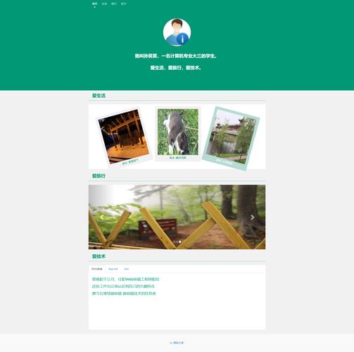
(图片来源网络,侵删)


