- 一个可以直接复制粘贴的完整代码示例(包含HTML、CSS和一点JavaScript)。
- 详细的代码解析,让你明白每一部分的作用。
- 如何修改和个性化你的网页。
- 一些进阶建议,让你的网页更上一层楼。
第一步:准备工作
你只需要一个文本编辑器(如 VS Code, Sublime Text, 或者 Windows 自带的记事本)和一个浏览器(如 Chrome, Firefox, Edge)即可。
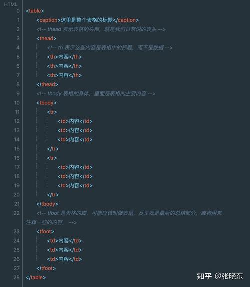
(图片来源网络,侵删)
第二步:完整代码示例
这是一个包含个人简介、技能、项目和联系方式的现代简约风格个人网页。
文件名:index.html
<!DOCTYPE html>
<html lang="zh-CN">
<head>
<meta charset="UTF-8">
<meta name="viewport" content="width=device-width, initial-scale=1.0">张三 - 个人主页</title>
<link rel="stylesheet" href="style.css">
<!-- 引入一个图标库,方便使用图标 -->
<link rel="stylesheet" href="https://cdnjs.cloudflare.com/ajax/libs/font-awesome/6.0.0-beta3/css/all.min.css">
</head>
<body>
<!-- 导航栏 -->
<header>
<nav class="container">
<a href="#" class="logo">ZS</a>
<ul class="nav-links">
<li><a href="#about">关于我</a></li>
<li><a href="#skills">技能</a></li>
<li><a href="#projects">项目</a></li>
<li><a href="#contact">联系我</a></li>
</ul>
</nav>
</header>
<main>
<!-- 首页/英雄区 -->
<section id="hero">
<div class="container">
<div class="hero-content">
<h1>你好,我是 <span class="highlight">张三</span></h1>
<p>一名充满激情的前端开发工程师</p>
<div class="hero-buttons">
<a href="#projects" class="btn primary">查看我的作品</a>
<a href="#contact" class="btn secondary">联系我</a>
</div>
</div>
</div>
</section>
<!-- 关于我 -->
<section id="about" class="section">
<div class="container">
<h2 class="section-title">关于我</h2>
<div class="about-content">
<div class="about-text">
<p>
我是一名热爱编程和创造的前端开发者,拥有3年的Web开发经验,专注于使用现代技术栈(如HTML5, CSS3, JavaScript, React)构建用户友好、高性能的网站和网络应用。
</p>
<p>
我相信好的代码不仅要功能完善,更要易于维护和扩展,在业余时间,我喜欢探索新技术、参与开源项目,并通过写博客来分享我的学习心得。
</p>
</div>
<div class="about-image">
<!-- 你可以在这里放一张你的照片 -->
<img src="https://via.placeholder.com/300" alt="张三的照片">
</div>
</div>
</div>
</section>
<!-- 技能 -->
<section id="skills" class="section bg-light">
<div class="container">
<h2 class="section-title">我的技能</h2>
<div class="skills-grid">
<div class="skill-card">
<i class="fab fa-html5"></i>
<h3>HTML5</h3>
<p>语义化标签,可访问性最佳实践</p>
</div>
<div class="skill-card">
<i class="fab fa-css3-alt"></i>
<h3>CSS3</h3>
<p>Flexbox, Grid, 响应式设计, 动画</p>
</div>
<div class="skill-card">
<i class="fab fa-js-square"></i>
<h3>JavaScript</h3>
<p>ES6+, 异步编程, DOM操作</p>
</div>
<div class="skill-card">
<i class="fab fa-react"></i>
<h3>React</h3>
<p>组件化开发, Hooks, Redux</p>
</div>
</div>
</div>
</section>
<!-- 项目 -->
<section id="projects" class="section">
<div class="container">
<h2 class="section-title">我的项目</h2>
<div class="projects-grid">
<div class="project-card">
<img src="https://via.placeholder.com/400x250" alt="项目1截图">
<h3>电商网站</h3>
<p>使用React和Node.js构建的全栈电商应用,包含用户认证、购物车和支付功能。</p>
<div class="project-links">
<a href="#" target="_blank"><i class="fas fa-external-link-alt"></i> 在线预览</a>
<a href="#" target="_blank"><i class="fab fa-github"></i> 源代码</a>
</div>
</div>
<div class="project-card">
<img src="https://via.placeholder.com/400x250" alt="项目2截图">
<h3>任务管理应用</h3>
<p>一个基于Vue.js的响应式任务管理工具,支持拖拽排序和任务分类。</p>
<div class="project-links">
<a href="#" target="_blank"><i class="fas fa-external-link-alt"></i> 在线预览</a>
<a href="#" target="_blank"><i class="fab fa-github"></i> 源代码</a>
</div>
</div>
</div>
</div>
</section>
<!-- 联系我 -->
<section id="contact" class="section bg-light">
<div class="container">
<h2 class="section-title">联系我</h2>
<p class="contact-intro">有项目想合作?或者只是想打个招呼?随时欢迎!</p>
<div class="contact-links">
<a href="mailto:your.email@example.com" class="contact-link">
<i class="fas fa-envelope"></i> your.email@example.com
</a>
<a href="https://github.com/yourusername" class="contact-link" target="_blank">
<i class="fab fa-github"></i> GitHub
</a>
<a href="https://linkedin.com/in/yourusername" class="contact-link" target="_blank">
<i class="fab fa-linkedin"></i> LinkedIn
</a>
</div>
</div>
</section>
</main>
<!-- 页脚 -->
<footer>
<div class="container">
<p>© 2025 张三. All rights reserved.</p>
</div>
</footer>
<script src="script.js"></script>
</body>
</html>
文件名:style.css
/* --- 全局样式 --- */
:root {
    --primary-color: #007bff;
    --secondary-color: #6c757d;
    --light-color: #f8f9fa;
    --dark-color: #343a40;
    --text-color: #333;
    --box-shadow: 0 4px 15px rgba(0, 0, 0, 0.1);
}
* {
    margin: 0;
    padding: 0;
    box-sizing: border-box;
}
html {
    scroll-behavior: smooth;
}
body {
    font-family: 'Segoe UI', Tahoma, Geneva, Verdana, sans-serif;
    line-height: 1.6;
    color: var(--text-color);
}
.container {
    width: 90%;
    max-width: 1100px;
    margin: 0 auto;
    padding: 0 20px;
}
h1, h2, h3 {
    font-weight: 600;
    line-height: 1.2;
}
h1 { font-size: 2.5rem; }
h2 { font-size: 2rem; }
h3 { font-size: 1.3rem; }
p { margin-bottom: 1rem; }
.section {
    padding: 80px 0;
}
.section-title {
    text-align: center;
    margin-bottom: 50px;
    color: var(--dark-color);
}
.bg-light {
    background-color: var(--light-color);
}
.btn {
    display: inline-block;
    padding: 12px 25px;
    border-radius: 5px;
    text-decoration: none;
    font-weight: 600;
    transition: all 0.3s ease;
    cursor: pointer;
    border: none;
}
.btn.primary {
    background-color: var(--primary-color);
    color: white;
}
.btn.primary:hover {
    background-color: #0056b3;
}
.btn.secondary {
    background-color: transparent;
    color: var(--primary-color);
    border: 2px solid var(--primary-color);
}
.btn.secondary:hover {
    background-color: var(--primary-color);
    color: white;
}
/* --- 导航栏 --- */
header {
    background: #fff;
    box-shadow: var(--box-shadow);
    position: fixed;
    width: 100%;
    top: 0;
    z-index: 1000;
}
nav {
    display: flex;
    justify-content: space-between;
    align-items: center;
    padding: 20px 0;
}
.logo {
    font-size: 1.5rem;
    font-weight: 700;
    color: var(--dark-color);
    text-decoration: none;
}
.nav-links {
    display: flex;
    list-style: none;
}
.nav-links li a {
    color: var(--text-color);
    text-decoration: none;
    padding: 10px 15px;
    transition: color 0.3s ease;
}
.nav-links li a:hover {
    color: var(--primary-color);
}
/* --- 首页/英雄区 --- */
#hero {
    height: 100vh;
    display: flex;
    align-items: center;
    text-align: center;
    background: linear-gradient(rgba(0, 0, 0, 0.5), rgba(0, 0, 0, 0.5)), url('https://images.unsplash.com/photo-1557682257-2f9c37a3a5f3?ixlib=rb-4.0.3') no-repeat center center/cover;
    color: white;
}
.hero-content h1 {
    margin-bottom: 20px;
}
.hero-content p {
    font-size: 1.2rem;
    margin-bottom: 30px;
}
.highlight {
    color: var(--primary-color);
}
/* --- 关于我 --- */
.about-content {
    display: flex;
    align-items: center;
    gap: 40px;
}
.about-text {
    flex: 1;
}
.about-image img {
    max-width: 300px;
    border-radius: 10px;
    box-shadow: var(--box-shadow);
}
/* --- 技能 --- */
.skills-grid {
    display: grid;
    grid-template-columns: repeat(auto-fit, minmax(250px, 1fr));
    gap: 30px;
}
.skill-card {
    background: #fff;
    padding: 30px;
    text-align: center;
    border-radius: 10px;
    box-shadow: var(--box-shadow);
    transition: transform 0.3s ease;
}
.skill-card:hover {
    transform: translateY(-10px);
}
.skill-card i {
    font-size: 3rem;
    color: var(--primary-color);
    margin-bottom: 20px;
}
/* --- 项目 --- */
.projects-grid {
    display: grid;
    grid-template-columns: repeat(auto-fit, minmax(350px, 1fr));
    gap: 30px;
}
.project-card {
    background: #fff;
    border-radius: 10px;
    overflow: hidden;
    box-shadow: var(--box-shadow);
    transition: transform 0.3s ease;
}
.project-card:hover {
    transform: translateY(-10px);
}
.project-card img {
    width: 100%;
    height: 250px;
    object-fit: cover;
}
.project-card-content {
    padding: 25px;
}
.project-links {
    margin-top: 20px;
    display: flex;
    gap: 15px;
}
.project-links a {
    color: var(--primary-color);
    text-decoration: none;
    font-size: 0.9rem;
    display: flex;
    align-items: center;
    gap: 5px;
}
/* --- 联系我 --- */
.contact-intro {
    text-align: center;
    max-width: 600px;
    margin: 0 auto 40px;
    font-size: 1.1rem;
}
.contact-links {
    display: flex;
    justify-content: center;
    gap: 30px;
    flex-wrap: wrap;
}
.contact-link {
    display: flex;
    align-items: center;
    gap: 10px;
    color: var(--dark-color);
    text-decoration: none;
    font-size: 1.1rem;
    padding: 15px 25px;
    background: #fff;
    border-radius: 50px;
    box-shadow: var(--box-shadow);
    transition: all 0.3s ease;
}
.contact-link:hover {
    background-color: var(--primary-color);
    color: white;
}
/* --- 页脚 --- */
footer {
    background-color: var(--dark-color);
    color: #fff;
    text-align: center;
    padding: 20px 0;
}
/* --- 响应式设计 --- */
@media (max-width: 768px) {
    .nav-links {
        display: none; /* 在移动端可以换成汉堡菜单 */
    }
    .hero-content h1 {
        font-size: 2rem;
    }
    .about-content, .skills-grid, .projects-grid {
        flex-direction: column;
        gap: 30px;
    }
    .contact-links {
        flex-direction: column;
        align-items: center;
    }
}
文件名:script.js
(图片来源网络,侵删)
// 这个文件是空的,但我们保留它以便将来添加交互功能,
// - 导航栏滚动时改变样式
// - 平滑滚动到锚点
// - 动态加载内容等
// 示例:当页面滚动时,给导航栏添加一个阴影效果
window.addEventListener('scroll', function() {
    const header = document.querySelector('header');
    if (window.scrollY > 100) {
        header.style.boxShadow = '0 2px 10px rgba(0,0,0,0.1)';
    } else {
        header.style.boxShadow = 'none';
    }
});
第三步:如何运行和修改
-
创建文件:在你的电脑上创建一个文件夹,
my-portfolio,在文件夹里创建三个文件:index.html、style.css和script.js,并把上面的代码分别复制进去。 -
替换图片:
- 在
index.html中,找到<img src="https://via.placeholder.com/300" alt="张三的照片">,把src属性的值替换成你自己的照片链接(把照片放在my-portfolio文件夹里,就可以写成src="my-photo.jpg")。 - 同样地,替换项目部分的图片 (
src="https://via.placeholder.com/400x250")。
- 在
-
修改文本内容:
- 打开
index.html,把所有的 "张三"、"前端开发工程师" 等文本替换成你自己的信息。 - 修改你的邮箱、GitHub、LinkedIn 等链接。
- 打开
-
运行网页:
- 直接用浏览器打开
index.html文件,你就能看到你的个人网页了! - (推荐)如果你使用 VS Code,可以安装 "Live Server" 插件,右键点击
index.html选择 "Open with Live Server",这样网页会在本地服务器上运行,体验更好。
- 直接用浏览器打开
第四步:代码解析
index.html (骨架)
<!DOCTYPE html>: 声明这是一个HTML5文档。<html lang="zh-CN">: 整个网页的根元素,lang属性帮助搜索引擎和浏览器理解语言。<head>: 包含网页的元数据,不会直接显示在页面上。<meta charset="UTF-8">: 确保浏览器能正确显示中文等特殊字符。<meta name="viewport" ...>: 响应式设计的核心,告诉浏览器如何控制页面的尺寸和缩放。<title>: 显示在浏览器标签页上的标题。<link rel="stylesheet" ...>: 链接到我们的CSS样式文件,让HTML变好看。<link rel="stylesheet" href="...font-awesome...">: 链接到一个图标库,方便我们在按钮和链接旁加上小图标。
<body>: 网页所有可见内容都放在这里。- 语义化标签:我们使用了
<header>,<main>,<section>,<footer>等,这些标签不仅让HTML结构更清晰,也有利于SEO(搜索引擎优化)和无障碍访问。 id属性:每个主要区块都有一个唯一的id(如id="about"),这让我们可以通过导航栏链接直接跳转到该位置。class属性:class用于给元素分组,以便在CSS中统一样式,所有需要居中并限制宽度的容器都有container类。
- 语义化标签:我们使用了
style.css (样式)
- CSS变量 (
root):我们定义了一些颜色和样式变量(如--primary-color),这样,如果想更换主题色,只需要在root里修改一次即可,非常方便。 - 盒模型 (
box-sizing: border-box):这是一个非常重要的设置,它让padding和border不会增加元素的总宽度,让布局更可控。 - Flexbox 和 Grid:
- Flexbox 用于一维布局(如导航栏、按钮组),通过
display: flex轻松实现元素的对齐和分布。 - Grid 用于二维布局(如技能卡片、项目卡片),通过
display: grid可以轻松创建复杂的网格结构,并且是响应式的。
- Flexbox 用于一维布局(如导航栏、按钮组),通过
- 响应式设计:通过媒体查询
@media (max-width: 768px),我们为小屏幕设备(如手机)提供了不同的布局,在大屏幕上并排显示的内容,在手机上会变成垂直堆叠。 - 交互效果:
transition属性为hover状态(如鼠标悬停)的变化添加了平滑的动画效果,提升了用户体验。
script.js (行为)
- 虽然这个例子很简单,但
script.js的存在非常重要,它为未来的交互功能预留了空间。 - 我们添加了一个简单的示例:当页面向下滚动超过100像素时,给导航栏添加一个阴影,让它看起来“固定”在顶部,提升了导航体验。
第五步:进阶建议
当你熟悉了这些基础后,可以尝试以下功能让你的网页更专业:
- 添加汉堡菜单:在移动端,将导航栏的链接列表隐藏,用一个汉堡图标(三条横线)代替,点击后展开菜单。
- 制作一个“返回顶部”按钮:当用户滚动到页面底部时,显示一个按钮,点击后平滑滚动回页面顶部。
- 使用CSS动画:为你的名字、技能卡片等添加进入动画,让页面加载时更有趣。
- 部署到线上:将你的网站部署到 GitHub Pages、Vercel 或 Netlify 等平台,这样别人就可以通过网址访问你的个人主页了。
- 添加简历下载:在“联系我”部分添加一个下载PDF简历的链接。
希望这个详细的指南能帮助你成功制作出属于自己的个人网页!祝你玩得开心!


