目录
- 【入门级】经典浪漫型 - 简单直接,心意满满
- 【进阶级】互动游戏型 - 增加趣味,拉近距离
- 【高阶级】动态粒子型 - 视觉震撼,科技感十足
- 【创意级】倒计时型 - 精心准备,期待未来
- 【隐藏彩蛋】终极代码库 - 一个页面,多种效果
【入门级】经典浪漫型
这类网页适合喜欢简单、直接、真诚表达的用户,核心是文字和背景。
(图片来源网络,侵删)
爱心背景 + 浮动文字
这个页面会显示一个巨大的爱心背景,中间有“我喜欢你”的字样,字体会跳动,非常有爱。
代码:
<!DOCTYPE html>
<html lang="zh-CN">
<head>
    <meta charset="UTF-8">
    <meta name="viewport" content="width=device-width, initial-scale=1.0">我喜欢你</title>
    <style>
        /* 全局样式 */
        body, html {
            height: 100%;
            margin: 0;
            display: flex;
            justify-content: center;
            align-items: center;
            background-color: #f0f0f0;
            font-family: 'Arial', sans-serif;
        }
        /* 爱心容器 */
        .heart-container {
            position: relative;
            width: 100%;
            height: 100%;
            display: flex;
            justify-content: center;
            align-items: center;
        }
        /* 爱心形状 */
        .heart {
            position: absolute;
            width: 200px;
            height: 180px;
            background-color: red;
            transform: rotate(-45deg);
        }
        .heart::before,
        .heart::after {
            content: '';
            position: absolute;
            width: 200px;
            height: 200px;
            background-color: red;
            border-radius: 50%;
        }
        .heart::before {
            top: -100px;
            left: 0;
        }
        .heart::after {
            left: 100px;
            top: 0;
        }
        /* 文字样式 */
        .love-text {
            position: relative;
            z-index: 10; /* 确保文字在爱心之上 */
            color: white;
            font-size: 3em;
            font-weight: bold;
            text-shadow: 2px 2px 8px rgba(0,0,0,0.5);
            animation: pulse 1.5s infinite;
        }
        /* 跳动动画 */
        @keyframes pulse {
            0% { transform: scale(1); }
            50% { transform: scale(1.1); }
            100% { transform: scale(1); }
        }
    </style>
</head>
<body>
    <div class="heart-container">
        <div class="heart"></div>
        <div class="love-text">我喜欢你</div>
    </div>
</body>
</html>
【进阶级】互动游戏型
这类网页通过简单的互动来增加趣味性,让表白过程不那么紧张。
“不要放弃”按钮游戏
用户需要点击“不要放弃”按钮才能看到表白信息,如果点到“放弃”,按钮会跑到别处,增加挑战性。
(图片来源网络,侵删)
代码:
<!DOCTYPE html>
<html lang="zh-CN">
<head>
    <meta charset="UTF-8">
    <meta name="viewport" content="width=device-width, initial-scale=1.0">一个小小的挑战</title>
    <style>
        body {
            display: flex;
            justify-content: center;
            align-items: center;
            height: 100vh;
            margin: 0;
            background-color: #ffdddd;
            font-family: 'Comic Sans MS', cursive;
            overflow: hidden; /* 防止按钮跑出屏幕出现滚动条 */
        }
        .container {
            text-align: center;
        }
        h1 {
            color: #333;
        }
        .buttons {
            margin-top: 20px;
        }
        button {
            font-size: 1.2em;
            padding: 10px 20px;
            margin: 0 10px;
            cursor: pointer;
            border: none;
            border-radius: 5px;
            transition: all 0.3s;
        }
        #yesBtn {
            background-color: #4CAF50;
            color: white;
        }
        #noBtn {
            position: absolute;
            background-color: #f44336;
            color: white;
        }
        .message {
            display: none;
            margin-top: 20px;
            font-size: 1.5em;
            color: #d9534f;
            font-weight: bold;
        }
    </style>
</head>
<body>
    <div class="container">
        <h1>做我女朋友好不好?</h1>
        <div class="buttons">
            <button id="yesBtn">好呀</button>
            <button id="noBtn">不要</button>
        </div>
        <div class="message" id="message">太棒了!我们在一起吧!</div>
    </div>
    <script>
        const yesBtn = document.getElementById('yesBtn');
        const noBtn = document.getElementById('noBtn');
        const message = document.getElementById('message');
        yesBtn.addEventListener('click', () => {
            message.style.display = 'block';
            noBtn.style.display = 'none'; // 隐藏“不要”按钮
            yesBtn.style.display = 'none'; // 隐藏“好呀”按钮
        });
        noBtn.addEventListener('click', () => {
            // 随机改变“不要”按钮的位置
            const randomX = Math.random() * (window.innerWidth - 100); // 减去按钮宽度
            const randomY = Math.random() * (window.innerHeight - 50);  // 减去按钮高度
            noBtn.style.left = randomX + 'px';
            noBtn.style.top = randomY + 'px';
        });
    </script>
</body>
</html>
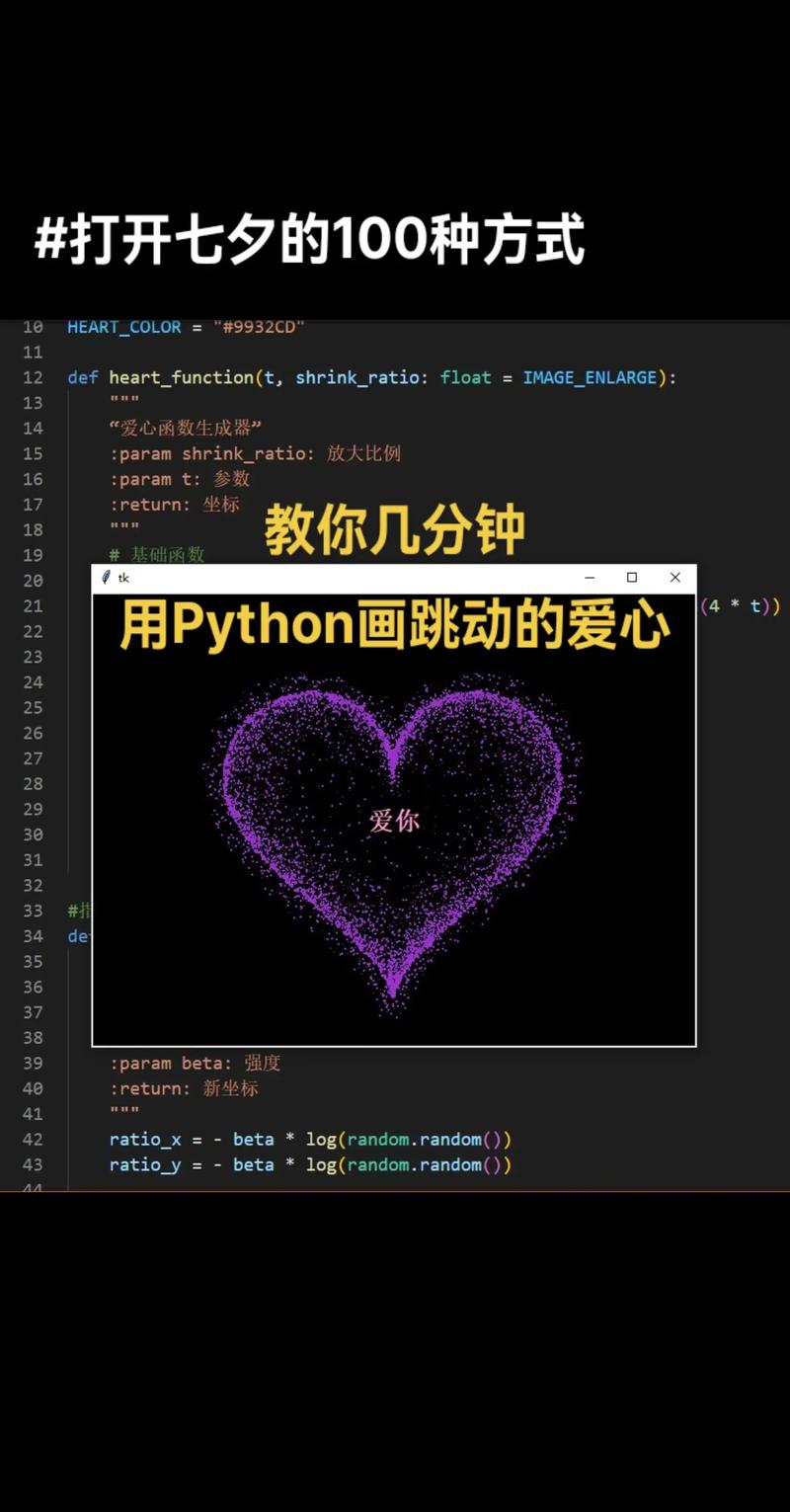
【高阶级】动态粒子型
这类网页使用 Canvas 和 JavaScript 创建动态效果,视觉冲击力强,显得非常用心。
爱心粒子环绕 + 3D翻转文字
粒子会围绕鼠标或文字形成爱心,并且文字有3D翻转效果。
代码:
<!DOCTYPE html>
<html lang="zh-CN">
<head>
    <meta charset="UTF-8">
    <meta name="viewport" content="width=device-width, initial-scale=1.0">心动的感觉</title>
    <style>
        body {
            margin: 0;
            overflow: hidden;
            background: #000;
            display: flex;
            justify-content: center;
            align-items: center;
            height: 100vh;
            font-family: 'Arial';
        }
        canvas {
            position: absolute;
            top: 0;
            left: 0;
        }
        .text-container {
            position: relative;
            z-index: 10;
            perspective: 1000px; /* 3D透视效果 */
        }
        .flip-text {
            font-size: 4em;
            color: #fff;
            text-shadow: 0 0 10px #ff0080;
            animation: flip3d 3s infinite;
            transform-style: preserve-3d;
        }
        @keyframes flip3d {
            0% { transform: rotateY(0deg); }
            50% { transform: rotateY(180deg); }
            100% { transform: rotateY(360deg); }
        }
    </style>
</head>
<body>
    <canvas id="heartCanvas"></canvas>
    <div class="text-container">
        <div class="flip-text">我爱你</div>
    </div>
    <script>
        const canvas = document.getElementById('heartCanvas');
        const ctx = canvas.getContext('2d');
        // 设置画布大小
        function resizeCanvas() {
            canvas.width = window.innerWidth;
            canvas.height = window.innerHeight;
        }
        resizeCanvas();
        window.addEventListener('resize', resizeCanvas);
        // 粒子类
        class Particle {
            constructor(x, y) {
                this.x = x;
                this.y = y;
                this.size = Math.random() * 5 + 1;
                this.speedX = Math.random() * 3 - 1.5;
                this.speedY = Math.random() * 3 - 1.5;
                this.color = `hsl(${Math.random() * 360}, 100%, 50%)`;
                this.life = 100;
            }
            update() {
                this.x += this.speedX;
                this.y += this.speedY;
                if (this.size > 0.2) this.size -= 0.05;
                this.life -= 1;
            }
            draw() {
                ctx.fillStyle = this.color;
                ctx.globalAlpha = this.life / 100;
                ctx.beginPath();
                ctx.arc(this.x, this.y, this.size, 0, Math.PI * 2);
                ctx.fill();
            }
        }
        const particles = [];
        const mouse = { x: null, y: null, radius: 150 };
        window.addEventListener('mousemove', (e) => {
            mouse.x = e.x;
            mouse.y = e.y;
        });
        // 创建爱心形状的粒子
        function createHeartParticles() {
            const centerX = canvas.width / 2;
            const centerY = canvas.height / 2;
            for (let i = 0; i < 5; i++) {
                const angle = Math.random() * Math.PI * 2;
                const x = centerX + 16 * Math.pow(Math.sin(angle), 3) * 5;
                const y = centerY - (13 * Math.cos(angle) - 5 * Math.cos(2 * angle) - 2 * Math.cos(3 * angle) - Math.cos(4 * angle)) * 5;
                particles.push(new Particle(x, y));
            }
        }
        // 动画循环
        function animate() {
            ctx.clearRect(0, 0, canvas.width, canvas.height);
            ctx.globalAlpha = 1;
            // 鼠标吸引粒子
            particles.forEach((p, index) => {
                p.update();
                p.draw();
                if (p.life <= 0) {
                    particles.splice(index, 1);
                }
            });
            requestAnimationFrame(animate);
        }
        // 定期创建爱心
        setInterval(createHeartParticles, 200);
        animate();
    </script>
</body>
</html>
【创意级】倒计时型
这类网页适合在特殊的日子(如生日、纪念日)使用,表达“我为你准备了很久”的诚意。
距离我们在一起还有 X 天
这个页面会计算距离某个未来日期的天数,并有一个精美的倒计时动画。
代码:
<!DOCTYPE html>
<html lang="zh-CN">
<head>
    <meta charset="UTF-8">
    <meta name="viewport" content="width=device-width, initial-scale=1.0">我们的纪念日倒计时</title>
    <style>
        body {
            background: linear-gradient(135deg, #667eea 0%, #764ba2 100%);
            color: white;
            font-family: 'Arial', sans-serif;
            display: flex;
            flex-direction: column;
            justify-content: center;
            align-items: center;
            height: 100vh;
            text-align: center;
        }
        h1 {
            font-size: 2.5em;
            margin-bottom: 20px;
        }
        .countdown-container {
            display: flex;
            gap: 30px;
            margin-top: 40px;
        }
        .time-box {
            background: rgba(255, 255, 255, 0.2);
            border-radius: 10px;
            padding: 20px;
            min-width: 100px;
            backdrop-filter: blur(10px);
            box-shadow: 0 8px 32px rgba(0, 0, 0, 0.1);
        }
        .time-number {
            font-size: 3em;
            font-weight: bold;
            display: block;
        }
        .time-label {
            font-size: 1em;
            margin-top: 5px;
        }
    </style>
</head>
<body>
    <h1>距离我们在一起,还有...</h1>
    <div class="countdown-container">
        <div class="time-box">
            <span class="time-number" id="days">00</span>
            <span class="time-label">天</span>
        </div>
        <div class="time-box">
            <span class="time-number" id="hours">00</span>
            <span class="time-label">小时</span>
        </div>
        <div class="time-box">
            <span class="time-number" id="minutes">00</span>
            <span class="time-label">分钟</span>
        </div>
        <div class="time-box">
            <span class="time-number" id="seconds">00</span>
            <span class="time-label">秒</span>
        </div>
    </div>
    <script>
        // !!! 请在这里修改你的目标日期 !!!
        // 格式: "YYYY-MM-DDTHH:mm:ss"
        const targetDate = new Date("2025-12-31T00:00:00").getTime();
        function updateCountdown() {
            const now = new Date().getTime();
            const distance = targetDate - now;
            if (distance < 0) {
                document.querySelector("h1").innerHTML = "我们在一起啦!";
                clearInterval(countdownInterval);
                return;
            }
            const days = Math.floor(distance / (1000 * 60 * 60 * 24));
            const hours = Math.floor((distance % (1000 * 60 * 60 * 24)) / (1000 * 60 * 60));
            const minutes = Math.floor((distance % (1000 * 60 * 60)) / (1000 * 60));
            const seconds = Math.floor((distance % (1000 * 60)) / 1000);
            document.getElementById("days").innerText = String(days).padStart(2, '0');
            document.getElementById("hours").innerText = String(hours).padStart(2, '0');
            document.getElementById("minutes").innerText = String(minutes).padStart(2, '0');
            document.getElementById("seconds").innerText = String(seconds).padStart(2, '0');
        }
        // 立即执行一次,然后每秒更新
        updateCountdown();
        const countdownInterval = setInterval(updateCountdown, 1000);
    </script>
</body>
</html>
【隐藏彩蛋】终极代码库
这个页面将所有效果融合在一起,通过点击不同的按钮来切换不同的表白场景,是一个“万金油”式的终极解决方案。
代码:
<!DOCTYPE html>
<html lang="zh-CN">
<head>
    <meta charset="UTF-8">
    <meta name="viewport" content="width=device-width, initial-scale=1.0">终极表白页面</title>
    <style>
        /* 全局样式 */
        body, html {
            height: 100%;
            margin: 0;
            font-family: 'Arial', sans-serif;
            overflow: hidden;
            background: #000;
            color: white;
        }
        .main-container {
            display: flex;
            flex-direction: column;
            justify-content: center;
            align-items: center;
            height: 100vh;
            text-align: center;
        }
        h1 {
            font-size: 3em;
            margin-bottom: 30px;
        }
        .buttons {
            display: flex;
            gap: 20px;
        }
        button {
            padding: 15px 30px;
            font-size: 1.2em;
            cursor: pointer;
            border: none;
            border-radius: 50px;
            background: linear-gradient(45deg, #ff6ec7, #7873f5);
            color: white;
            transition: transform 0.3s, box-shadow 0.3s;
        }
        button:hover {
            transform: scale(1.1);
            box-shadow: 0 0 20px rgba(255, 110, 199, 0.7);
        }
        /* 场景容器 */
        .scene {
            display: none;
            position: absolute;
            top: 0;
            left: 0;
            width: 100%;
            height: 100%;
        }
        .scene.active {
            display: block;
        }
        /* 场景1: 简单浪漫 */
        #scene1 {
            background: linear-gradient(135deg, #f093fb 0%, #f5576c 100%);
            display: flex;
            justify-content: center;
            align-items: center;
        }
        .simple-text {
            font-size: 5em;
            animation: pulse 2s infinite;
        }
        @keyframes pulse {
            0% { transform: scale(1); }
            50% { transform: scale(1.05); }
            100% { transform: scale(1); }
        }
        /* 场景2: 互动游戏 */
        #scene2 {
            background: #ffdddd;
        }
        #scene2 h1, #scene2 .message { color: #333; }
        #scene2 button { background-color: #4CAF50; color: white; }
        #scene2 #noBtn { background-color: #f44336; }
        /* 场景3: 粒子效果 */
        #scene3 { background: #000; }
        #scene3 h1 { color: #fff; text-shadow: 0 0 10px #ff0080; }
        #scene3 .flip-text { font-size: 4em; animation: flip3d 3s infinite; }
        @keyframes flip3d {
            0% { transform: rotateY(0deg); }
            50% { transform: rotateY(180deg); }
            100% { transform: rotateY(360deg); }
        }
        #heartCanvas { position: absolute; top: 0; left: 0; }
        /* 场景4: 倒计时 */
        #scene4 {
            background: linear-gradient(135deg, #667eea 0%, #764ba2 100%);
        }
        .countdown-container {
            display: flex;
            gap: 30px;
            margin-top: 40px;
        }
        .time-box {
            background: rgba(255, 255, 255, 0.2);
            border-radius: 10px;
            padding: 20px;
            min-width: 100px;
        }
        .time-number { font-size: 3em; font-weight: bold; display: block; }
        .time-label { font-size: 1em; margin-top: 5px; }
    </style>
</head>
<body>
    <!-- 主菜单 -->
    <div class="main-container" id="mainMenu">
        <h1>选择一个场景开始表白吧</h1>
        <div class="buttons">
            <button onclick="showScene(1)">简单浪漫</button>
            <button onclick="showScene(2)">趣味互动</button>
            <button onclick="showScene(3)">视觉盛宴</button>
            <button onclick="showScene(4)">精心准备</button>
        </div>
    </div>
    <!-- 场景1: 简单浪漫 -->
    <div class="scene" id="scene1">
        <div class="simple-text">我爱你</div>
    </div>
    <!-- 场景2: 互动游戏 -->
    <div class="scene" id="scene2">
        <h1>做我女朋友好不好?</h1>
        <div class="buttons" style="position: relative;">
            <button id="yesBtn2">好呀</button>
            <button id="noBtn2">不要</button>
        </div>
        <div class="message" id="message2">太棒了!我们在一起吧!</div>
    </div>
    <!-- 场景3: 粒子效果 -->
    <div class="scene" id="scene3">
        <div class="text-container">
            <div class="flip-text">我爱你</div>
        </div>
        <canvas id="heartCanvas"></canvas>
    </div>
    <!-- 场景4: 倒计时 -->
    <div class="scene" id="scene4">
        <h1>距离我们在一起,还有...</h1>
        <div class="countdown-container">
            <div class="time-box">
                <span class="time-number" id="days">00</span>
                <span class="time-label">天</span>
            </div>
            <div class="time-box">
                <span class="time-number" id="hours">00</span>
                <span class="time-label">小时</span>
            </div>
            <div class="time-box">
                <span class="time-number" id="minutes">00</span>
                <span class="time-label">分钟</span>
            </div>
            <div class="time-box">
                <span class="time-number" id="seconds">00</span>
                <span class="time-label">秒</span>
            </div>
        </div>
    </div>
    <script>
        // --- 场景切换逻辑 ---
        function showScene(sceneNumber) {
            document.getElementById('mainMenu').style.display = 'none';
            document.getElementById('scene1').classList.remove('active');
            document.getElementById('scene2').classList.remove('active');
            document.getElementById('scene3').classList.remove('active');
            document.getElementById('scene4').classList.remove('active');
            document.getElementById(`scene${sceneNumber}`).classList.add('active');
            // 初始化特定场景的逻辑
            if (sceneNumber === 2) initGame();
            if (sceneNumber === 3) initParticles();
            if (sceneNumber === 4) initCountdown();
        }
        // --- 场景2: 游戏逻辑 ---
        function initGame() {
            const yesBtn = document.getElementById('yesBtn2');
            const noBtn = document.getElementById('noBtn2');
            const message = document.getElementById('message2');
            yesBtn.onclick = () => {
                message.style.display = 'block';
                noBtn.style.display = 'none';
                yesBtn.style.display = 'none';
            };
            noBtn.onclick = () => {
                const randomX = Math.random() * (window.innerWidth - 100);
                const randomY = Math.random() * (window.innerHeight - 50);
                noBtn.style.position = 'absolute';
                noBtn.style.left = randomX + 'px';
                noBtn.style.top = randomY + 'px';
            };
        }
        // --- 场景3: 粒子逻辑 ---
        function initParticles() {
            const canvas = document.getElementById('heartCanvas');
            const ctx = canvas.getContext('2d');
            canvas.width = window.innerWidth;
            canvas.height = window.innerHeight;
            class Particle { /* (同上) */ }
            // ... (此处省略完整的粒子类代码,请参考【高阶级】部分) ...
            // 为了简洁,这里只展示框架,实际使用时请复制完整代码
            console.log("粒子效果已激活,请参考【高阶级】部分获取完整JS代码。");
        }
        // --- 场景4: 倒计时逻辑 ---
        function initCountdown() {
            const targetDate = new Date("2025-12-31T00:00:00").getTime();
            function updateCountdown() { /* (同上) */ }
            updateCountdown();
            setInterval(updateCountdown, 1000);
        }
    </script>
</body>
</html>
如何使用这些代码?
- 复制代码:选择你最喜欢的一款,将全部代码复制下来。
- 创建文件:在你的电脑上新建一个文本文档,将代码粘贴进去。
- 修改文件名:将文件名从
新建文本文档.txt修改为love.html(后缀名必须是.html)。 - 个性化修改:
- 修改文字内容,如“我喜欢你”改成你的名字。
- 修改颜色、字体大小等样式。
- 在【创意级】倒计时中,修改
targetDate为你的目标日期。
- 打开网页:双击
love.html文件,它就会在你的默认浏览器中打开。
也是最重要的:代码是辅助,最真诚的心意永远是最好的表白工具,祝你成功!


