作业设计思路
这个设计将包含一个现代、简洁的家居网站首页,旨在展示一个功能完整的前端页面,主要包含以下几个核心部分:
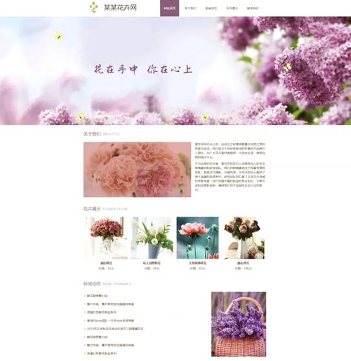
(图片来源网络,侵删)
- 顶部导航栏:包含网站Logo、主导航菜单(如首页、产品、关于我们、灵感)和用户操作区(登录、购物车)。
- 主视觉区域:一个全屏的Banner,展示一张高质量的家居图片,并配有吸引人的标题和行动号召按钮。
- 精选产品展示:以网格布局展示几款热门的家居产品,每件产品都有图片、名称、价格和“加入购物车”按钮。
- 特色服务/理念介绍:用图标和简短的文字介绍网站的特色,如“免费设计咨询”、“全球直采”、“品质保证”等。
- 灵感文章/博客预览:展示一些关于家居搭配、装修技巧的文章,吸引用户浏览更多内容。
- 页脚:包含网站的联系方式、社交媒体链接、版权信息等。
最终效果预览
你可以直接将下面的代码复制到一个.html文件中,然后用浏览器打开,就能看到最终效果。
完整HTML代码
<!DOCTYPE html>
<html lang="zh-CN">
<head>
<meta charset="UTF-8">
<meta name="viewport" content="width=device-width, initial-scale=1.0">雅居生活 - 您的品质家居之选</title>
<!-- 引入 Bootstrap 5 CSS -->
<link href="https://cdn.jsdelivr.net/npm/bootstrap@5.3.0-alpha1/dist/css/bootstrap.min.css" rel="stylesheet">
<!-- 引入 Bootstrap Icons -->
<link rel="stylesheet" href="https://cdn.jsdelivr.net/npm/bootstrap-icons@1.10.3/font/bootstrap-icons.css">
<style>
/* 全局样式重置和自定义CSS */
body {
font-family: 'Microsoft YaHei', 'PingFang SC', sans-serif;
color: #333;
}
/* 导航栏样式 */
.navbar {
background-color: #fff;
box-shadow: 0 2px 4px rgba(0,0,0,.08);
padding: 1rem 0;
}
.navbar-brand {
font-weight: bold;
font-size: 1.5rem;
color: #2c3e50 !important;
}
.navbar-nav .nav-link {
color: #555 !important;
margin: 0 10px;
font-weight: 500;
transition: color 0.3s ease;
}
.navbar-nav .nav-link:hover {
color: #e67e22 !important;
}
.btn-login {
background-color: #e67e22;
color: white;
border: none;
padding: 8px 20px;
border-radius: 20px;
transition: background-color 0.3s ease;
}
.btn-login:hover {
background-color: #d35400;
color: white;
}
/* 主视觉区域样式 */
.hero-section {
background: linear-gradient(rgba(0, 0, 0, 0.4), rgba(0, 0, 0, 0.4)), url('https://images.unsplash.com/photo-1600585154340-be6161a56a0c?ixlib=rb-4.0.3&ixid=M3wxMjA3fDB8MHxwaG90by1wYWdlfHx8fGVufDB8fHx8fA%3D%3D&auto=format&fit=crop&w=1770&q=80') no-repeat center center/cover;
color: white;
height: 80vh;
display: flex;
align-items: center;
justify-content: center;
text-align: center;
}
.hero-content h1 {
font-size: 3.5rem;
font-weight: bold;
margin-bottom: 20px;
}
.hero-content p {
font-size: 1.25rem;
margin-bottom: 30px;
}
.btn-shop-now {
background-color: #e67e22;
color: white;
border: none;
padding: 12px 30px;
font-size: 1.1rem;
border-radius: 30px;
transition: transform 0.3s ease, box-shadow 0.3s ease;
}
.btn-shop-now:hover {
background-color: #d35400;
color: white;
transform: translateY(-3px);
box-shadow: 0 10px 20px rgba(0,0,0,0.2);
}
/* 产品展示区样式 */
.section-title {
text-align: center;
font-size: 2.5rem;
font-weight: bold;
margin-bottom: 50px;
color: #2c3e50;
}
.product-card {
border: none;
border-radius: 10px;
overflow: hidden;
transition: transform 0.3s ease, box-shadow 0.3s ease;
height: 100%;
}
.product-card:hover {
transform: translateY(-10px);
box-shadow: 0 15px 30px rgba(0,0,0,0.1);
}
.product-card img {
height: 250px;
object-fit: cover;
width: 100%;
}
.product-info {
padding: 20px;
}
.product-info h5 {
font-weight: bold;
margin-bottom: 10px;
}
.product-price {
color: #e67e22;
font-size: 1.25rem;
font-weight: bold;
}
.btn-add-cart {
background-color: #2c3e50;
color: white;
border: none;
width: 100%;
padding: 10px;
border-radius: 5px;
transition: background-color 0.3s ease;
}
.btn-add-cart:hover {
background-color: #1a252f;
color: white;
}
/* 特色服务区样式 */
.features {
background-color: #f8f9fa;
padding: 80px 0;
}
.feature-item {
text-align: center;
padding: 20px;
}
.feature-item i {
font-size: 3rem;
color: #e67e22;
margin-bottom: 20px;
}
.feature-item h4 {
font-weight: bold;
margin-bottom: 15px;
}
/* 灵感文章区样式 */
.inspiration-section {
padding: 80px 0;
}
.inspiration-card {
border: none;
border-radius: 10px;
overflow: hidden;
height: 100%;
transition: transform 0.3s ease;
}
.inspiration-card:hover {
transform: scale(1.03);
}
.inspiration-card img {
height: 200px;
object-fit: cover;
width: 100%;
}
.inspiration-content {
padding: 20px;
}
.inspiration-content h5 {
font-weight: bold;
margin-bottom: 10px;
}
/* 页脚样式 */
footer {
background-color: #2c3e50;
color: #ecf0f1;
padding: 40px 0 20px;
}
footer h5 {
font-weight: bold;
margin-bottom: 20px;
}
footer ul {
list-style: none;
padding: 0;
}
footer ul li {
margin-bottom: 10px;
}
footer ul li a {
color: #bdc3c7;
text-decoration: none;
transition: color 0.3s ease;
}
footer ul li a:hover {
color: #e67e22;
}
.social-icons a {
color: #bdc3c7;
font-size: 1.5rem;
margin-right: 15px;
transition: color 0.3s ease;
}
.social-icons a:hover {
color: #e67e22;
}
.copyright {
text-align: center;
margin-top: 30px;
padding-top: 20px;
border-top: 1px solid #34495e;
color: #95a5a6;
}
</style>
</head>
<body>
<!-- 顶部导航栏 -->
<nav class="navbar navbar-expand-lg navbar-light sticky-top">
<div class="container">
<a class="navbar-brand" href="#"><i class="bi bi-house-heart-fill"></i> 雅居生活</a>
<button class="navbar-toggler" type="button" data-bs-toggle="collapse" data-bs-target="#navbarNav">
<span class="navbar-toggler-icon"></span>
</button>
<div class="collapse navbar-collapse" id="navbarNav">
<ul class="navbar-nav mx-auto">
<li class="nav-item">
<a class="nav-link active" href="#">首页</a>
</li>
<li class="nav-item">
<a class="nav-link" href="#">产品</a>
</li>
<li class="nav-item">
<a class="nav-link" href="#">空间方案</a>
</li>
<li class="nav-item">
<a class="nav-link" href="#">灵感</a>
</li>
<li class="nav-item">
<a class="nav-link" href="#">关于我们</a>
</li>
</ul>
<div class="d-flex">
<a href="#" class="btn btn-login me-2"><i class="bi bi-person-circle"></i> 登录</a>
<a href="#" class="btn btn-outline-dark"><i class="bi bi-cart3"></i> 购物车</a>
</div>
</div>
</div>
</nav>
<!-- 主视觉区域 -->
<section class="hero-section">
<div class="hero-content">
<h1>打造您的梦想之家</h1>
<p>探索我们精心挑选的现代家居系列,让生活更有品质</p>
<a href="#" class="btn btn-shop-now">立即选购</a>
</div>
</section>
<!-- 精选产品展示 -->
<section class="py-5">
<div class="container">
<h2 class="section-title">精选产品</h2>
<div class="row g-4">
<!-- 产品卡片 1 -->
<div class="col-md-4">
<div class="card product-card">
<img src="https://images.unsplash.com/photo-1555066931-4365d14bab8c?ixlib=rb-4.0.3&ixid=M3wxMjA3fDB8MHxwaG90by1wYWdlfHx8fGVufDB8fHx8fA%3D%3D&auto=format&fit=crop&w=1170&q=80" class="card-img-top" alt="北欧风沙发">
<div class="card-body product-info">
<h5 class="card-title">简约主义布艺沙发</h5>
<p class="card-text text-muted">舒适透气,简约设计,完美融入现代家居。</p>
<div class="d-flex justify-content-between align-items-center">
<span class="product-price">¥3,999</span>
<a href="#" class="btn btn-add-cart">加入购物车</a>
</div>
</div>
</div>
</div>
<!-- 产品卡片 2 -->
<div class="col-md-4">
<div class="card product-card">
<img src="https://images.unsplash.com/photo-1554995207-c18c203602cb?ixlib=rb-4.0.3&ixid=M3wxMjA3fDB8MHxwaG90by1wYWdlfHx8fGVufDB8fHx8fA%3D%3D&auto=format&fit=crop&w=1170&q=80" class="card-img-top" alt="实木餐桌">
<div class="card-body product-info">
<h5 class="card-title">天然橡木餐桌</h5>
<p class="card-text text-muted">实木打造,坚固耐用,为您的家庭聚餐增添温馨。</p>
<div class="d-flex justify-content-between align-items-center">
<span class="product-price">¥5,680</span>
<a href="#" class="btn btn-add-cart">加入购物车</a>
</div>
</div>
</div>
</div>
<!-- 产品卡片 3 -->
<div class="col-md-4">
<div class="card product-card">
<img src="https://images.unsplash.com/photo-1600880292203-757bb62b4baf?ixlib=rb-4.0.3&ixid=M3wxMjA3fDB8MHxwaG90by1wYWdlfHx8fGVufDB8fHx8fA%3D%3D&auto=format&fit=crop&w=1170&q=80" class="card-img-top" alt="吊灯">
<div class="card-body product-info">
<h5 class="card-title">创意金属吊灯</h5>
<p class="card-text text-muted">光影艺术,为您的客厅带来独特的视觉焦点。</p>
<div class="d-flex justify-content-between align-items-center">
<span class="product-price">¥1,280</span>
<a href="#" class="btn btn-add-cart">加入购物车</a>
</div>
</div>
</div>
</div>
</div>
</div>
</section>
<!-- 特色服务 -->
<section class="features">
<div class="container">
<div class="row">
<div class="col-md-4 feature-item">
<i class="bi bi-lightbulb"></i>
<h4>免费设计咨询</h4>
<p>专业设计师团队,为您提供一对一的家居搭配建议,让家更懂你。</p>
</div>
<div class="col-md-4 feature-item">
<i class="bi bi-globe"></i>
<h4>全球直采</h4>
<p>与全球顶级家居品牌合作,省去中间环节,为您带来高性价比的优质产品。</p>
</div>
<div class="col-md-4 feature-item">
<i class="bi bi-shield-check"></i>
<h4>品质保证</h4>
<p>所有产品均经过严格筛选,提供完善的售后保障,让您购物无忧。</p>
</div>
</div>
</div>
</section>
<!-- 灵感文章 -->
<section class="inspiration-section">
<div class="container">
<h2 class="section-title">设计灵感</h2>
<div class="row g-4">
<div class="col-md-6">
<div class="card inspiration-card">
<img src="https://images.unsplash.com/photo-1555046921-4365d14bab8c?ixlib=rb-4.0.3&ixid=M3wxMjA3fDB8MHxwaG90by1wYWdlfHx8fGVufDB8fHx8fA%3D%3D&auto=format&fit=crop&w=1170&q=80" class="card-img-top" alt="客厅设计">
<div class="card-body inspiration-content">
<h5>2025年客厅设计趋势:回归自然与简约</h5>
<p class="card-text text-muted">探索今年最流行的客厅设计风格,从色彩到材质,打造一个宁静舒适的休憩空间...</p>
<a href="#" class="btn btn-link p-0">阅读更多 <i class="bi bi-arrow-right"></i></a>
</div>
</div>
</div>
<div class="col-md-6">
<div class="card inspiration-card">
<img src="https://images.unsplash.com/photo-1551698618-1dfe5d97d256?ixlib=rb-4.0.3&ixid=M3wxMjA3fDB8MHxwaG90by1wYWdlfHx8fGVufDB8fHx8fA%3D%3D&auto=format&fit=crop&w=1170&q=80" class="card-img-top" alt="卧室设计">
<div class="card-body inspiration-content">
<h5>打造一个治愈系卧室:色彩与光线的魔法</h5>
<p class="card-text text-muted">一个好的卧室是疲惫一天的避风港,学会运用柔和的色彩和温暖的光线,...</p>
<a href="#" class="btn btn-link p-0">阅读更多 <i class="bi bi-arrow-right"></i></a>
</div>
</div>
</div>
</div>
</div>
</section>
<!-- 页脚 -->
<footer>
<div class="container">
<div class="row">
<div class="col-md-4">
<h5>关于雅居生活</h5>
<p>我们致力于为每一位顾客提供高品质、有设计感的家居产品,让美好生活触手可及。</p>
<div class="social-icons">
<a href="#"><i class="bi bi-wechat"></i></a>
<a href="#"><i class="bi bi-sina-weibo"></i></a>
<a href="#"><i class="bi bi-instagram"></i></a>
</div>
</div>
<div class="col-md-4">
<h5>快速链接</h5>
<ul>
<li><a href="#">全部产品</a></li>
<li><a href="#">新品上市</a></li>
<li><a href="#">热销排行</a></li>
<li><a href="#">优惠活动</a></li>
</ul>
</div>
<div class="col-md-4">
<h5>联系我们</h5>
<ul>
<li><i class="bi bi-geo-alt"></i> 北京市朝阳区xxx路xxx号</li>
<li><i class="bi bi-telephone"></i> 400-888-8888</li>
<li><i class="bi bi-envelope"></i> service@yajush.com</li>
</ul>
</div>
</div>
<div class="copyright">
<p>© 2025 雅居生活. All Rights Reserved. | 京ICP备xxxxxxxx号</p>
</div>
</div>
</footer>
<!-- 引入 Bootstrap 5 JS (包含 Popper) -->
<script src="https://cdn.jsdelivr.net/npm/bootstrap@5.3.0-alpha1/dist/js/bootstrap.bundle.min.js"></script>
</body>
</html>
代码结构详解
HTML 结构
<!DOCTYPE html>: 声明文档类型为HTML5。<head>: 包含页面的元数据。<meta charset="UTF-8">: 设置字符编码为UTF-8,确保中文正确显示。<meta name="viewport"...>: 响应式设计的核心,告诉浏览器如何控制页面的尺寸和缩放。<title>: 页面标题,显示在浏览器标签页上。<link>: 引入外部CSS文件,这里我们使用了 Bootstrap 5 框架,它提供了强大的响应式栅格系统和预置的UI组件,同时引入了 Bootstrap Icons 图标库,方便使用各种图标。
<body>: 页面的可见内容。<nav>: 导航栏,使用Bootstrap的navbar组件,并通过自定义CSS使其更美观。sticky-top类让导航栏在滚动时始终固定在顶部。<section class="hero-section">: 主视觉区域,使用一个div作为背景容器,通过CSS设置背景图片和渐变遮罩,使其文字更清晰。<section class="py-5">: 精选产品区。py-5是Bootstrap的padding类,表示上下内边距,内部使用<div class="row">和<div class="col-md-4">来创建响应式的网格布局。<section class="features">: 特色服务区,使用<div class="row">将三个特色服务并排展示。<section class="inspiration-section">: 灵感文章区,同样使用网格布局展示文章卡片。<footer>: 页脚,使用<div class="row">分为三列,包含关于我们、快速链接和联系方式。<script>: 引入Bootstrap的JavaScript文件,Bootstrap的某些交互组件(如导航栏的折叠按钮)需要JS才能工作。
CSS 样式
- 全局样式:
body标签中设置了整个网站的字体和默认颜色。 - 导航栏样式: 自定义了
navbar的背景色、阴影效果,并对nav-link和btn-login添加了悬停效果,让交互更生动。 - 主视觉区域样式: 使用了
background属性结合linear-gradient和url()来创建带遮罩的背景图。display: flex和align-items: center等属性让内容完美居中。 - 产品卡片样式: 这是页面的亮点之一,通过
border-radius实现圆角,overflow: hidden让图片边缘圆滑,关键在于hover伪类,当鼠标悬停时,卡片会向上移动(transform: translateY)并产生阴影(box-shadow),极大地提升了用户体验。 - 特色服务区样式: 使用了柔和的背景色(
#f8f9fa)来区分区块。feature-item中的图标使用了Bootstrap Icons,并设置了醒目的橙色。 - 页脚样式: 使用深色背景和浅色文字形成对比。
<a>标签的悬停效果被设置为橙色,与网站主题色保持一致。
JavaScript
- 在这个作业中,JavaScript主要用于启用Bootstrap的交互功能,例如在小屏幕设备上点击汉堡菜单图标时,导航栏能够折叠展开,我们通过引入
bootstrap.bundle.min.js文件来实现这一点。
如何使用和改进
- 保存代码: 将上面的所有代码复制,粘贴到一个新的文本文件中,将其命名为
index.html。 - 打开预览: 用Chrome、Firefox等现代浏览器打开这个
index.html文件,你就能看到完整的网页效果。 - 调整和修改:
- 更换图片: 所有图片都使用了
unsplash.com提供的随机图片链接,你可以将这些src属性替换为你自己的图片URL。 - 修改文字: 直接编辑HTML中的文字内容即可,雅居生活”、“打造您的梦想之家”等。
- 调整颜色: 在
<style>标签中,你可以找到颜色变量(如#e67e22是主题橙色),修改它们可以改变整个网站的配色方案。 - 增加功能: 你可以进一步添加功能,比如点击“加入购物车”按钮时,使用JavaScript在控制台打印信息,或者弹出一个提示框,这可以作为进阶练习。
- 更换图片: 所有图片都使用了
这个作业设计涵盖了网页前端开发的基础知识(HTML结构、CSS样式、JS交互),并且具有一定的美观性和实用性,非常适合作为一份完整的HTML网页设计作业提交。
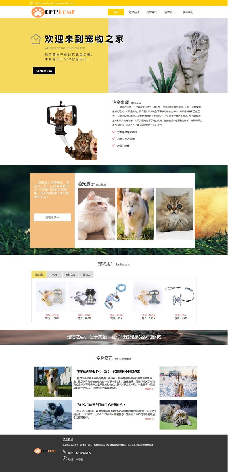
(图片来源网络,侵删)


